


Battle of the Editors: Daily Bruin Sports evaluates best, worst T-shirts given at UCLA sporting events
(Juliette Le Saint/Daily Bruin senior staff)


By Jared Tay, Jacqueline Dzwonczyk, Coral Smith, Jason Maikis, and Sam Connon
Aug. 18, 2019 3:37 p.m.
A defining part of a Bruin’s four years in Westwood is watching some of the best athletes in the nation compete in some of the most iconic stadiums – not to mention the free stuff. The Daily Bruin Sports editors compiled a list of some of the best and worst T-shirts up for grabs at UCLA sporting events over the past couple years.
Jared Tay, assistant Sports editor
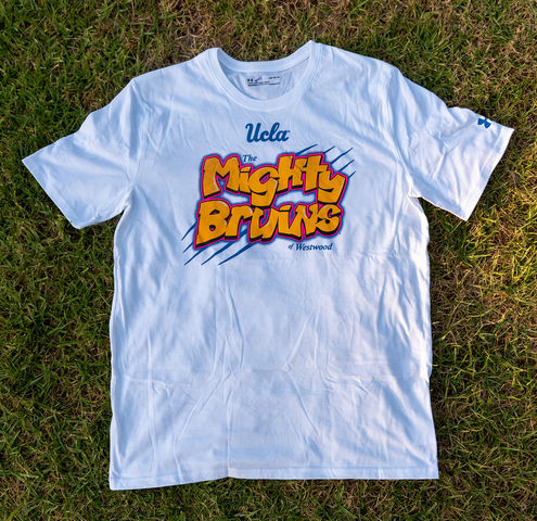
Best: The Mighty Bruins
The West Gate entrance to Bel Air sits just across Sunset Boulevard from the top of the Hill.
So it’s fitting that The Den made a shirt celebrating the 1990s hit sitcom that made the affluent Los Angeles community a household name.
The most striking feature of the shirt is the accuracy with which “The Fresh Prince of Bel-Air” logo was recreated. The bubbly style and graffiti-like font of the “Mighty Bruins” allows the shirt to be recognized as a re-creation of only one thing – the Fresh Prince.
The white background may look exceedingly large – especially since all the shirts came in size XL – but the shirt was featured for UCLA men’s basketball’s “white out” game against Notre Dame, and the sea of white that filled Pauley Pavilion was incredible. The night was capped off with a go-ahead 3-pointer by Kris Wilkes with less than a second remaining as the Bruins defeated the Fighting Irish.
Good vibes, good memories and a unique shirt. What’s not to like?
Worst: Bill Walton Tie-Dye
The tie-dye Bill Walton T-shirt was a good idea, but the final product left a lot to be desired.
The first thing that comes to mind when one looks at Walton’s image on the shirt is a jack-o’-lantern. Walton’s face and body are stenciled in yellow in an attempt to use the negative space of the shirt to create his figure. Anyone could carve that design into a pumpkin for Halloween, and that kind of minimalist outline doesn’t look good on a T-shirt.
Walton’s tie-dye shirt also looks like a big bull’s-eye. The center of the shirt, as a result, becomes the focal point of the shirt, which would be fine if it had more variation than just a few circles.
The biggest problem with the shirt is that it’s not really tie-dye. Sure, there are some waves of blue, but it’s not as flamboyant as it should be.
Walton deserves better.
Jacqueline Dzwonczyk, assistant Sports editor
Best: Play 4 Kay
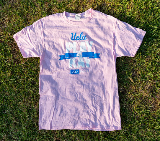
The Den has handed out a lot of free T-shirts, but only one in recent years has been pink.
At the annual UCLA women’s basketball Play 4 Kay Breast Cancer Awareness game in February, pink shirts are available to fans. This year, a light pink T-shirt and baseball cap were given to any fan who spun a giant wheel and answered – whether right or wrong – a trivia question about breast cancer.
The shirt’s color combination is different enough to stand out, but the shirt is still plain enough to wear on a day-to-day basis – unlike some of the more brash designs.
The Play 4 Kay shirt was the most unique item up for grabs at a UCLA sporting event this year, and it simultaneously supported a good cause.
Worst: UCLA Outs Depression
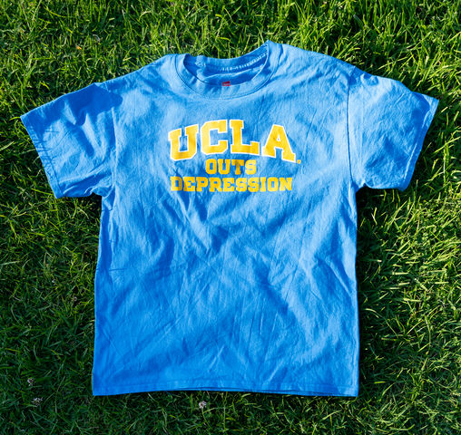
A blue shirt with gold block letters.
How original.
Not only is this T-shirt just about as basic as it gets, it also makes no sense out of context. The slogan was created by The Den to raise awareness of the Depression Grand Challenge and encourage UCLA students to participate in a survey that screens individuals for depression and anxiety.
The goal was admirable. The execution, not so much.
To anyone who didn’t attend the men’s basketball game against Utah on January 11, 2018, the shirt doesn’t convey any information about the cause.
Maybe the shirt could have featured the green depression awareness ribbon or a phone number to call for more information. Even a pamphlet would have been better than a T-shirt with “depression” printed across it in large block letters.
Coral Smith, assistant Sports editor
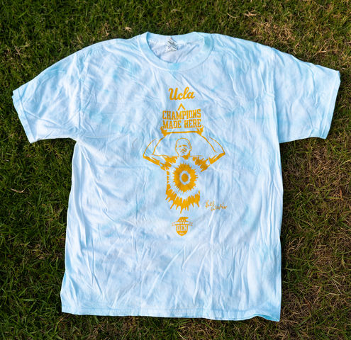
Best: Pyramid of Success
For many students last year, this was the first UCLA shirt they were given. And it’s a perfect example of how to make a simple, but not boring, design.
The large yellow pyramid outline contrasts well with the bright white of the letters and the classic Bruin blue of the fabric but isn’t as in your face as many other UCLA shirts.
The pyramid has significance beyond just being a cool design, as it represents the iconic Pyramid of Success that John Wooden used to help mold his players into successful athletes and people.
Choosing such an important symbol of UCLA and its athletic history was the perfect choice for the first shirt that incoming Bruins got because it immediately pulled them into the long and storied history of UCLA.
Worst: Basic UCLA Script
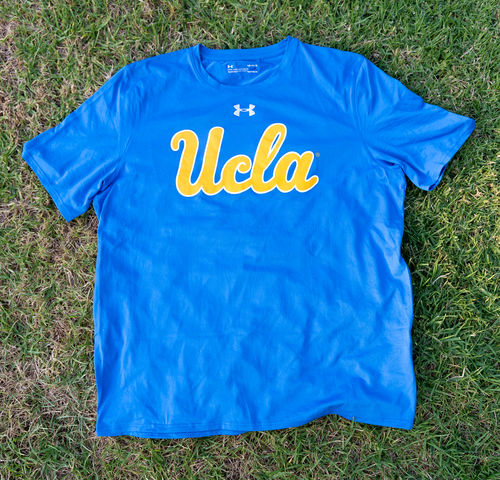
This shirt could have been so much more, but it fell short.
The blue shirt is plain, with a simple UCLA cursive logo as the only writing or decoration. There’s nothing wrong with the shirt, but with all the other more creative and flashy Bruin shirts now, it just pales in comparison.
This shirt is the one that gets thrown into the stands at games, making the students topple over each other as they leap to grasp the flying clothing.
For that much excitement, I would expect it to be more than just a logo that we’ve seen hundreds of times on other pieces of clothing.
It’s not inherently bad, it’s just not good.
Jason Maikis, assistant Sports editor
Best: Center Court Logo
Classic. Simple. Elegant. The Pauley Pavilion center court design is legendary and when the Bruins brought it back before the 2017-2018 season, they brought the style back to Westwood.
The smell of NCAA tournaments is in the air. John Wooden is back, and UCLA men’s basketball is rocking Pauley Pavilion.
The blue and yellow are obviously a complementary color pair, and everywhere you wear this shirt, people will know you rep the Bruins.
And when you’re walking around with UCLA on your chest, nothing flexes harder than 11 NCAA titles.
Worst: Tropical Yellow
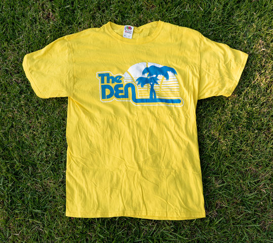
What is this yellow? Forget Bruin yellow, or even dandelion or neon – this is just awful.
The writing is in an ’80s-style font – which doesn’t really make any sense – and the palm trees are questionable at best as a symbol of UCLA. Maybe if the shirt actually had UCLA written on it anywhere at all, the palm trees could be a nice supplement.
But palm trees definitely don’t replace the name of the university.
The only somewhat redeemable part is the basketball cleverly drawn fading into the horizon like a sunset.
Overall, the color, lettering and design are subpar, and there’s no reference to UCLA.
And again, that yellow – yeesh.
Sam Connon, Sports editor
Best: Jackie Robinson “42”
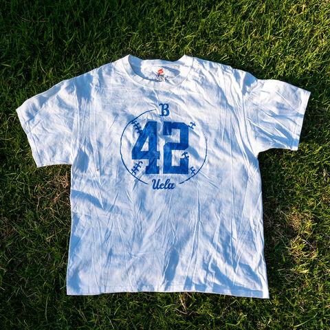
The 2018 Jackie Robinson shirt may not be one of the “nicer” Under Armour shirts, but the plain cotton Hanes works just fine. The “42” is a classic image seen all over campus, and this shirt was the only Jackie Robinson-inspired article of clothing I got my freshman year.
The slightly faded coloring is a nice touch, and the hand-drawn look of the baseball outline gives the shirt a nice down-to-earth feeling. Even if you didn’t want to wear it, the design alone would warrant hanging on your wall.
Robinson is one of the most iconic athletes in American history, and it’s only fitting his Den shirt is one of the best.
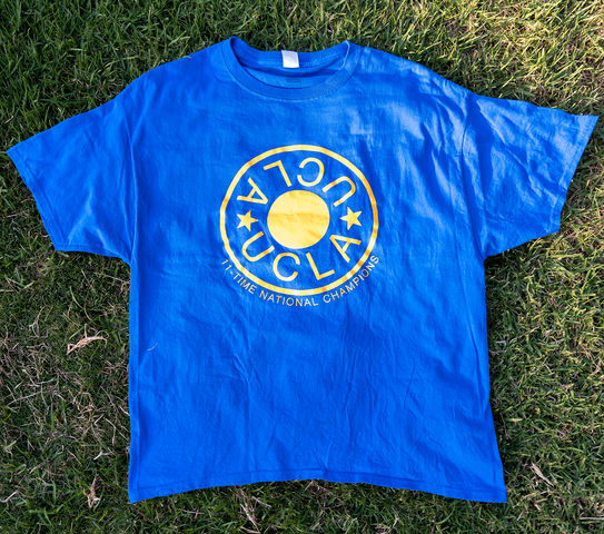
Worst: 11-Time National Champions
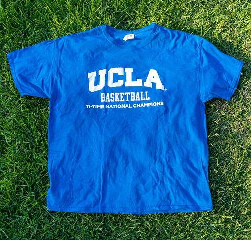
UCLA men’s basketball is arguably the most iconic hoops program in the country.
Eleven national titles, six hall of famers and the most valuable brand on the West Coast. But The Den shirt that tried its best to represent that legacy fell flat on its face.
A simple “UCLA Basketball: 11-Time National Champions” with nothing else around it is etched across the front of the plain blue shirt, in plain block letters. No design, no nothing.
The most lackluster brag in the history of brags.
UCLA is the most historic program in the sport, with grandiose and timeless icons to back it up. This shirt, however, is bare-bones and boring.
It also doesn’t help that they only gave out XLs.

