


Navigating MyUCLA’s design: Challenges and hopes for future improvement
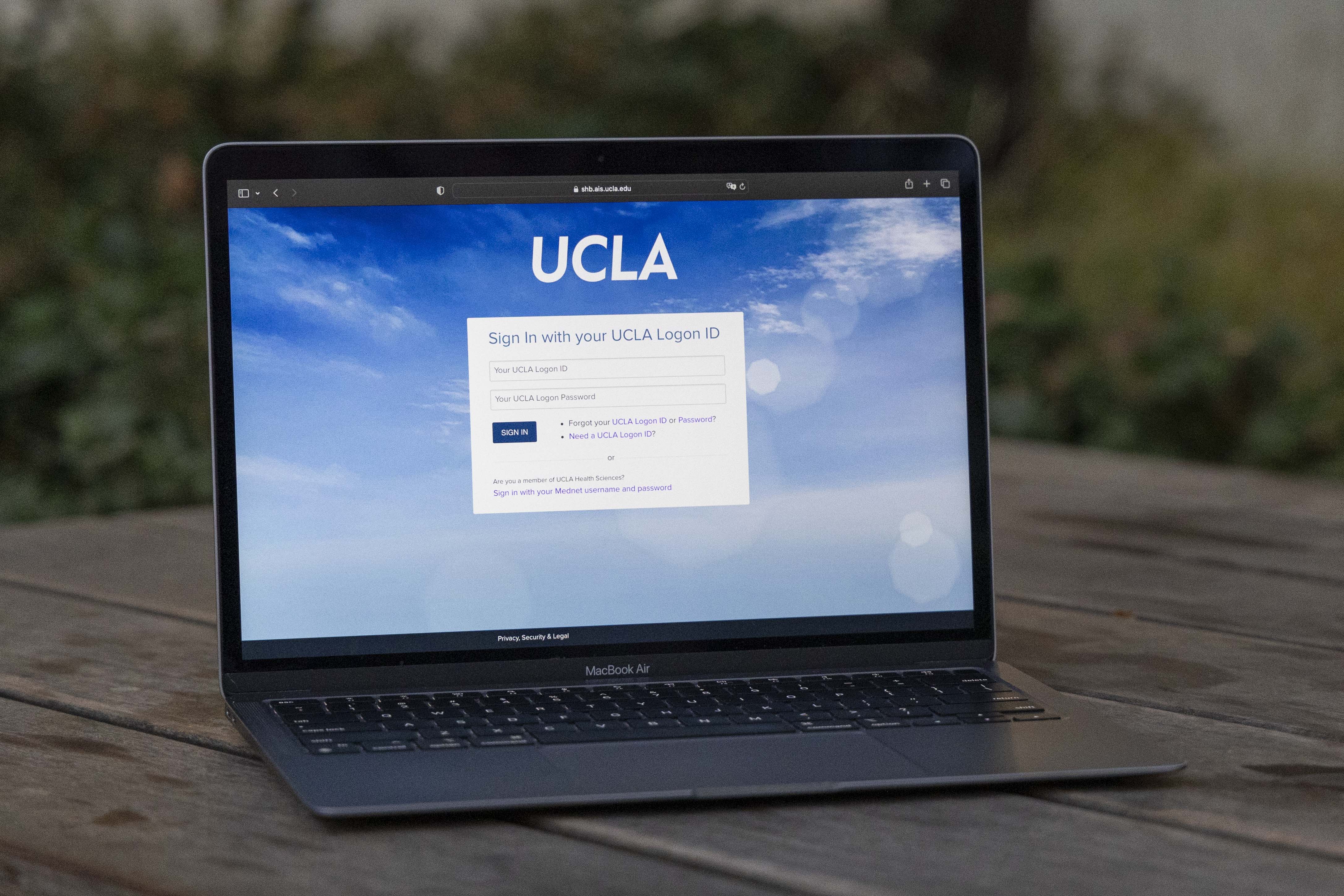
A desktop with the MyUCLA logon screen sits on a table. MyUCLA is UCLA’s student administrative website that houses resources for enrollment, grades and finances. While the site is important for Bruins, students and user experience designers have voiced concerns about its usability. (Shane Yu/Daily Bruin staff)

By Maia Hull
Nov. 25, 2023 7:48 a.m.
MyUCLA is a bookmarked website on many Bruins’ computers. It houses a multitude of essential functions and information for students, including planning and enrolling in classes, paying for school and generating degree progress reports. As frustrating as enrollment or as annoying as Duo Push can be, any grievances must be pushed aside, because interacting with this site is unavoidable.
But as important as this site is, there are many aspects Bruins wish could be changed or improved in order to smooth out the processes the site is responsible for.
Nathalie Guzman, a fourth-year sociology transfer student, said when she first used MyUCLA, it was overwhelming and confusing.
“The first time I did look at it was at my new student session with my NSA, and I was just like, ‘Thank God that they have someone here to walk me through it,’” Guzman said. “And even then, planning our classes, it’s just way too much of an overwhelming and also competitive process.”
As complicated as they can be to navigate, building websites is equally convoluted for web designers to plan, according to the Journal of Systems and Information Technology. The process of actually designing or redesigning such an important interface is complicated because it involves curating a website that is planned, visually appealing, necessary, easy to understand and helpful, according to the same source.
While MyUCLA might not be undergoing a complete redesign, Shei Gutierrez, a user experience designer and researcher, said she tries to start her process of redesigning a website by figuring out the sore spots of current users.
“That normally starts just by doing one-on-one interviews,” she said. “(It’s) just kind of asking the five W’s who, what, why, when, where and kind of getting to the root of what you think the problem is.”
Once the problem is established and the designer knows what they need to do, they can begin actually building a mock-up of the revised site, according to Gutierrez, a stage that applies to both completely new and revised sites.
After the mock-up, a prototype of the site is then created. The goal is to create a prototype with high usability, which describes the quality of a website. Usability also entails the users’ ability to know where they are on the site and what they can do on that page at any moment in time, according to the Journal of Systems and Information Technology.
Steve Smith, a user experience design expert, said the best thing one can do in order to guarantee the functions of a site is to test it.
“What we try to do is just use real users and test, and that’s called usability testing. You’re actually testing to watch real users try to complete the task,” he said. “See where they’re stumbling, see where they’re maybe almost making mistakes or where they get lost.”
Testing the viability of a website becomes even more important when considering how many users a website like a university portal will need to serve and how important the site is in terms of attracting potential students, serving current students and maintaining a good image of the institution, according to a study done at Stephen F. Austin State University in Texas.
According to the study, a student’s satisfaction with their portal depends on the student demographics, which varies across age, grade point average and school hours. As a result, it can be difficult to find a single system that works for everyone, according to the same source.
Guzman said when using MyUCLA, one issue she runs into is how long it can take to get to the most commonly used features of the site, which includes BruinBill and the class planner.
“Why do I have to go to three different pages just to get to BruinBill?” Guzman said. “I think just having the most used features, just right there on the front page, would be really helpful instead of having so much text.”
When navigating the MyUCLA website, certain features take you to different websites, such as accessing BruinBill or running a DARS report. All these sites have different layouts and appearances, which are confusing and hard to navigate for new users, Guzman said.
Smith said after spending time interacting with MyUCLA from a user experience designer’s perspective, he noticed the site struggles to cater to different people’s preferences. Smith said sites like these are hard to design because oftentimes different designers are all working on their own respective parts, so everything looks different.
But this discrepancy can be helped by implementing a design system, Smith said.
“Design systems basically give all the different development teams in that organization a standard set of components to work with, … with a goal of, one, you don’t have each team doing their own thing and creating their own kind of look and feel,” Smith said.
Smith said design systems greatly help users navigate websites as the design components will look mostly similar because they were designed with the same parameters.
In a written statement from Student Affairs Information Technology, Undergraduate Information Technology and IT Services, they said their staff constantly updates the site with new enhancements.
“MyUCLA is currently being reviewed and remediated to improve accessibility and we are eager to hear from students and host student focus groups to receive suggestions and ideas for improvements. … Student opinions have a huge impact on our future development efforts and we welcome feedback for improvement,” they wrote in the written statement.
Students are encouraged to submit any feedback they have at the “Send Feedback” links that are located on most MyUCLA pages, according to the same statement.
Bruins already have ideas on how to improve the site. Guzman said even just improving the look of the site would be beneficial especially after observing comparable sites across University of California schools.
“I find that all of them kind of look like this HTML format,” Guzman said. “And I’m like, ‘Why don’t you like make it nicer?'”

