


UCLA’s new COVID-19 dashboard offers more insight into cases on campus
UCLA revamped its COVID-19 dashboard to provide additional testing information and interactive graphics. (Screen capture by Lauren Man/Assistant Photo editor)


This post was updated Dec. 6 at 8:59 p.m.
UCLA’s updated COVID-19 dashboard is helpful for the UCLA community but could include more information, students and faculty said.
UCLA tracks COVID-19 infections among community members through its confirmed cases website. The university gets information about positive cases when community members test positive for COVID-19 at the Arthur Ashe Student Health and Wellness Center or when community members report cases directly to the university, said UCLA spokesperson Ricardo Vazquez.
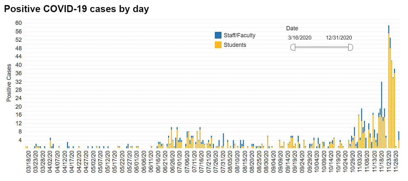
UCLA’s original website, which was created in March, provided daily updates with information about new positive cases on campus. The revamped website provides interactive graphics that show the number of students and faculty that test positive over time, the positivity rates of tests administered at the Ashe Center and a graph that compares the total number of cases in the UCLA community with cases in LA County.
The original dashboard received an F rating from We Rate Covid Dashboards, a website founded by Yale University professors Howard Forman and Cary Gross. The website gave UCLA’s updated dashboard an A- rating.
We Rate Covid Dashboards evaluates university dashboards on a 13-point scale that measures each dashboard’s readability and whether it is updated daily. The scale also takes into account the availability of statistics like county COVID-19 infection rates, frequency of testings and how soon test results come back.
Sarah Pitafi, a research assistant for Gross at Yale’s Cancer Outcomes, Public Policy and Effectiveness Research Center, said UCLA’s dashboard should include information about the frequency of testings, test turnaround times, isolation and quarantine data and a summary of the COVID-19 status on campus.
The information on UCLA’s original COVID-19 website was dense, hard to navigate and difficult to read, Pitafi said.
“(Universities) need to make information sensical for not just students, but also faculty, friends and people (who) are going to be around,” Pitafi said.
COVID-19 dashboards should present clear, interactive information that the general public can easily interpret, Pitafi said.
Steve Ritea, a spokesperson for UCLA who manages the dashboard, said the university did not change the dashboard because of the rating but added that UCLA is constantly looking for ways to better inform its community.
“Before learning of the grade, we were already talking about how to revamp the COVID-19 resources page,” Ritea said. “We were also working on how to offer additional data to fully contextualize the effects of (COVID-19) on our campus.”
Ritea said UCLA hopes the implementation of the dashboard will allow the community to understand the importance of vigilance and following social distancing guidelines.
Peter Katona, a public health professor and chairperson of the UCLA Infection Control Working Group, said the dashboard is useful for students and the UCLA community because it gives context to UCLA’s positive cases by comparing them with infection rates in other areas.
However, Katona said students would probably want to know about COVID-19 infection data from other universities around Los Angeles County.
“How are we doing comparatively? I would like to see that on a dashboard,” Katona said.
Assigning a color-coded emergency status system would also be helpful for the UCLA community to easily know the campus’s status, Pitafi said.
Some universities assign colors or numbers to relay the daily status of COVID-19 on and around campus, Pitafi said. She added that color codes help students understand the severity of the infection rates quickly.
Joanne Seung, a third-year biology student and a member of Asian Pacific American Health Collaboration, Access, Resource, and Education said she would like the dashboard to break down the total positive cases of COVID-19 in off-campus housing to hold students living in off-campus apartments and Greek life organizations accountable.
“If possible, it would be great to (monitor) different apartments, fraternities and sororities who are allowing students to live in their (complexes) and houses,” Seung said.
Vazquez said the university cannot report positive cases in sororities and fraternities because students may not test through UCLA or report results to the university.
Universities’ communication is critical going forward in shaping students’ plans for winter quarter and the eventual distribution of vaccines, Pitafi said.
COVID-19 dashboards are only useful when they make information readable and accessible to students, Katona said.
“If (COVID-19 dashboards) are done well, they’re really helpful,” Katona said. “If they’re not done well, people don’t pay a lot of attention to them.”

