


UCLA Mobile is hardly useful to students, lacking even the most basic features
(Alice Lu/Daily Bruin)

By Selby Kia
May 20, 2019 11:02 p.m.
Imagine having a UCLA mobile app, where you could access everything, from dining hall menus to class schedules, in one place.
Believe it or not, this app already exists. But chances are, you’ve probably never heard of it.
The UCLA Mobile app is meant to compile links to university resources into one dashboard for people to access more easily. The app gives users quick access to all of UCLA’s native apps that are listed in its app catalog.
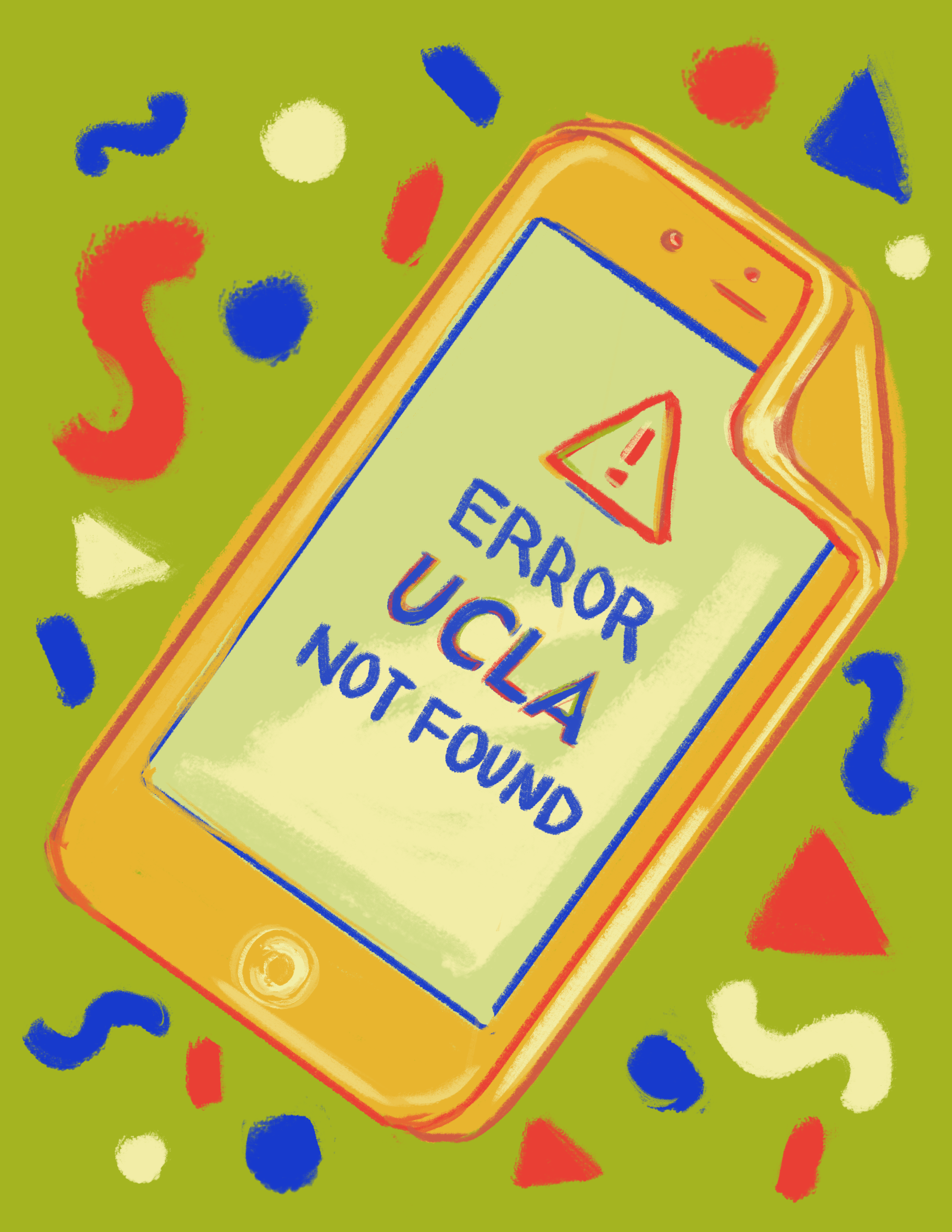
This might all sound great, but there’s one problem: The app is almost entirely useless to students.
It’s difficult to navigate, doesn’t include a search bar, links to other apps or webpages you can open up yourself, and even has a messages tab – perhaps so you can have that coveted one-on-one chat with Chancellor Gene Block.
And the worst part: This is all after 17 updates, the last one being May 11.
In other words, UCLA is still wasting money on this code calamity.
If the university is going to continue spending money on this app, it needs to deliver a viable product that meaningfully consolidates UCLA’s various services. The fact that students barely use the app demonstrates that, despite the years of effort and investment, UCLA is just engaging in this digital pet project for show, with mindless bug fixes and occasional updates to score participation points.
With currently only six ratings in the App Store and an average of 3.2 stars, the UCLA Mobile app clearly isn’t doing a great job of reaching the campus community and beyond. The app has been around since 2014 and is the byproduct of an extensive committee launched in 2010 as a campuswide initiative by more than 20 UCLA campus sectors, including the Office of Information Technology, the English department, the statistics department, the electrical and computer engineering department, UCLA Student Affairs, UCLA Library, the Office of Residential Life, the College of Letters and Science, the undergraduate student government, and UCLA Facilities Management.
With so many people involved, it’s still a wonder no one suggested having a search bar.
The app claims to be a one-stop shop for all things UCLA – something students, alumni, faculty and the community could look forward to using. Instead, it’s just a list of links to other websites and apps.
Emily Wang, a third-year computer science and linguistics student, said she would not use the app because she could Google all the information it provides. She added that the app’s design is not intuitive.
“There’s no search button, and I literally don’t know how I would use this app or what it’s for,” Wang said. “All the apps on top are just links.”
Wang admitted she deleted the app after being interviewed.
And she’s right to have: The app functions more like a glorified brochure. Clicking on the “Academics” tab leads to UCLA’s libraries, faculty and general overview websites. The “Students” tab leads to yet another academics tab. And the map icon leads to the Apple App Store to download yet another UCLA app – hardly practical for those actually looking for a location on campus.
Jessica Block, a second-year linguistics and psychology student, said she only uses the app to peruse dining hall menus – that too because someone happened to tell her about it during her freshman year.
It turns out, the dining hall menu is about the only understandable part of the app. Essential campus resources like financial aid, a campus map and who the dean of students is – her name is Maria Blandizzi, by the way – are only navigable via a labyrinth of links. In effect, the app is a redundant nesting doll of UCLA website links.
And the university is paying people to support this mobile mess.
That’s not to say the app doesn’t have potential. It would be useful if it had more in-house functionalities, a target audience and a clear path for users to navigate. It would benefit from direct access to study list features, a live feed of updates on campus happenings or notifications from the Arthur Ashe Student Health and Wellness Center about things like vaccinations.
While it might seem like a pointed attack at yet another failed UCLA app, we have to remember: This public university is spending money on this mobile app. The least it could do is make one that is actually usable.
The app might have made sense in 2009 – with its slogan of “Let Your Fingers Do the Scrolling.” It even goes so far as to inform students that with the creation of smartphones, they can access information “with the ease of reaching into (their pockets).”
But it’s 2019, and UCLA is putting out a primitive app. Students can already access resources like CCLE from their pockets. The point is to give them an easier way to do it.
A search bar might be a good start.

