


Bookmarked: Ooga Booga’s uninviting aura, stark aesthetic left something to be desired
Daily Bruin columnist Clea Wurster ventured to Chinatown to visit Ooga Booga, an art print bookstore, for the tenth installment of her column “Bookmarked.” Wurster enjoyed the eclectic mix of products the store offered, but found the store’s environment uninviting. (Bilal Ismail Ahmed/Daily Bruin senior staff)

By Clea Wurster
June 6, 2018 8:17 p.m.
Los Angeles is home to a multitude of specialized bookstores, from those oriented toward horror and mystery to others with more practical focuses, like cookbooks. Follow columnist Clea Wurster as she explores the many niche literary interests the city accommodates.
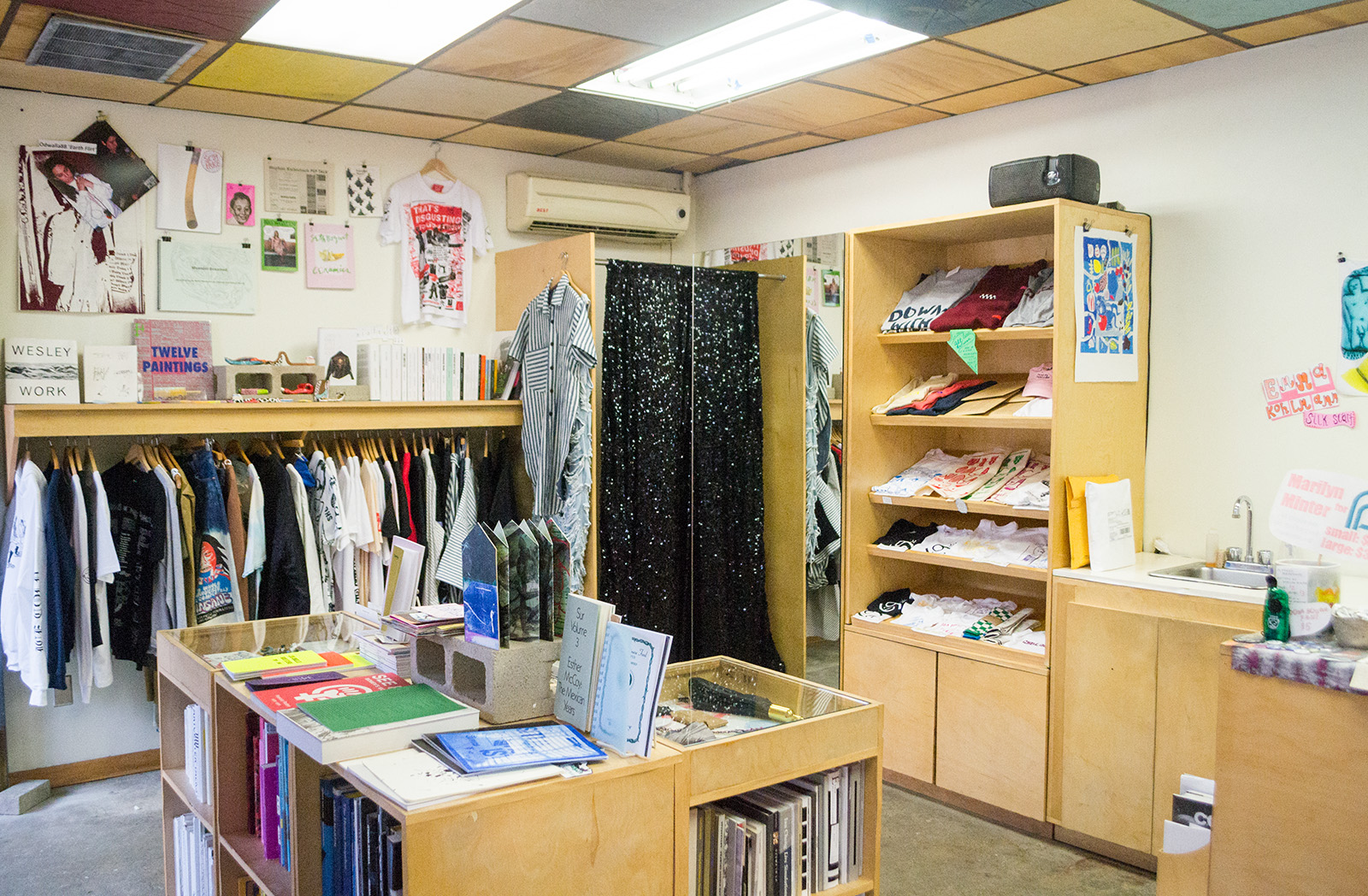
Ooga Booga, an art print bookstore, careens up two sets of stairs above a picturesque Chinatown shopping centre – a bit difficult to find and fairly out of place given its pretentious artsy vibes.
The store’s overall aura was disappointingly unfriendly, cool and aloof. Though the shelves were stocked with endearingly distinctive ‘zines and print books, I couldn’t force myself to stay longer than a quick 15 minutes.
I was given anything but a warm welcome from the girl at the counter, who was scrolling through her rose-pink iPhone and barely glanced up as I entered. I was slightly unsettled by the lack of music. Given the too-cool, artsy vibe that saturated the store, it was almost concerning that there weren’t equally uppity tunes to match.
The store consisted of one small room and was minimally stocked. To the left of the door there was one rack of colorful, one-of-a-kind clothing pieces. Many of the T-shirts were painted on directly with brightly hued acrylics and seemed to be the creations of local artists. Another shelving unit displayed simplistic, screen-printed tote bags. The designs were eye-catching and bold, featuring clean lines and vivid colors.
The ceiling was a grid of wooden squares, separated by darker wood and populated with random colored sections adding a bit of depth to the space. The lightly colored shelves and walls, and the flimsy covers of the books were careful not to overwhelm the space.
Two walls of shelving occupied the space and appeared sparsely lined with art-print books at first glance. Upon perusing for a while longer, I found many of the texts were of a homemade ‘zine variety – I felt like I was peeking into the author’s personal diaries, which seemed to be the intent.
While some books were more personal, featuring poetry and small sketches, others were more academically oriented, such as one that considered the shortcomings of symbolic logic – a philosophical tool for evaluating arguments.
Some of my favorite books were collections of posters, such as “See Red: Women’s Workshop,” a compilation of feminist posters from 1974 to 1990. One poster was a mock comic book strip of a woman who “doesn’t work,” doing daily household and care-taking chores. I appreciated the clever critique of patriarchal structures.
In addition to these politically themed books, I found a neon yellow paper-bound book of LA Rave Posters, featuring eccentric illustrations offering me a sneak peek into the ’90s of LA.
About ten minutes into my visit, the employee hooked her phone to an aux cord and began to play Kanye West’s latest album, a bit too loudly for my taste. Something about her delayed desire to create an ambience felt forced and I got the impression that the blaring tones were meant to drive me out.
Despite the off-putting aura, I kept searching through the quirky ‘zines for something I might like to buy. My favorite book may have been a book of photos, featuring a dark green cover behind a numbered list of photo titles, locations and dates in a basic Serif font. Some of the photos were from as long ago as 1959 and others were more recent, from 2014. The collection was eclectic, and aside from the similarly faded feel to the photos, there wasn’t any one subject tying them together. Some photos were of trees, others of street signs and others still were of people or homes.
I found the photos arranged in an enticing grid. The photos were small, borderless and touched by nostalgia. It felt like the curator of the book had given an incredible amount of consideration to the order of the photos and even the layout. Overall, I had a hard time placing it back on the shelf and am having the opposite of buyer’s remorse now that I’ve left the store.
Though the store reminded me of the mean, cool girl from middle school and made me want to leave fairly soon after I’d entered, there were some real gems among the shelves. The aesthetic of the store was stark and creative, but I would have appreciated a less intimidating environment or even felt like I was allowed to be in the store.
Ooga Booga showed promise, and had the music been a bit softer and the employee a bit friendlier, I would’ve loved to hang around a bit longer.


