


Throwback Thursday: How UC logo represents schools’ images, negative response to 2012 proposed change
(Daily Bruin archive)

By Alexa Greco
May 23, 2019 4:16 p.m.
The University of California logo is recognized and revered worldwide – but seven years ago, it almost fell by the wayside.
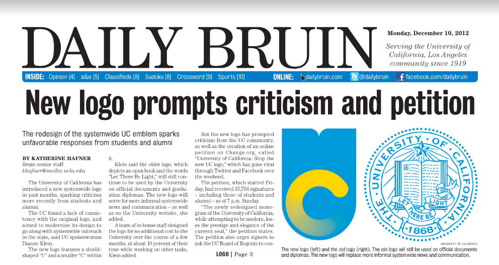
In December 2012, the UC released a new logo, which was soon met with criticism from students and alumni. The UC aimed to modernize its emblem to accompany its systemwide outreach in California, said UC spokeswoman Dianne Klein.
According to Klein, the UC still planned to use the old logo on official documents and graduation diplomas. The new logo, which featured a shield-shaped “U” and a smaller “C” within it, would be used for systemwide news and communication.
“(The new logo) is part of a larger effort to communicate the multifaceted aspect of the UC system as a whole, … it doesn’t replace individual campus identities,” Klein said. “What this does is allow for better systemwide marketing campaigns, for one.”
However, many other members of the UC community did not feel the same enthusiasm for the new logo. Within months of the announcement of the new logo, a petition called “University of California: Stop the new UC logo” was created on Change.org and was rapidly circulated through several social media platforms. Two days after its creation, the petition had received 35,756 signatures.
The petition urged signers to ask the UC Board of Regents to consider an alternative and stated the attempt to modernize the logo took away its prestige and elegance.
Klein explained that the idea behind the logo was to present the UC as a system, but some students suggested that the new logo might be counterproductive.
“We’re an internationally recognized university … I don’t see any other top-25 schools updating their logos,” said Jonathan Acosta, a first-year biochemistry student at the time.
Sarah Wagstaff, a first-year psychobiology student at the time, shared the sentiment that the logo did not need to be updated.
“Even though the original logo wasn’t exactly the greatest looking, it had a quiet dignity to it,” Wagstaff said.
Klein said she appreciated the feedback from students and alumni. The UC Board of Regents did take these opinions into account and the logo remains unchanged to this day.
The logo is a major part of the way our school is perceived by outsiders, representing UCLA’s legacy and reputation.
As the university celebrates 100 years, UCLA recognizes the history and traditions that have made our campus unique for the past century. The celebration – which was kicked off Saturday with an alumni day, a TEDx event and a light show – involves recognizing the accomplishments of the past 100 years, and looking forward to what the university will do in the next 100.
The UCLA Centennial Campaign fund was created July 2012, the same year as the proposed logo change. Part of the importance of UCLA’s 100th birthday comes from the brand the school has been building through the last 100 years, and the logo change may have erased some of UCLA’s history.
As UCLA gains more prestige as a university, the UC system looks to the future but this doesn’t have to mean revamping the school’s image. In the next 100 years, we will maintain some traditions and discard others. A look into the past shows us that students and faculty can have a lasting impact on decisions that can affect our legacy and tradition – and ultimately, how the UC system represents itself for the next 100 years.


