


Balloon & Panel: Format, pacing of comic panels changes perception
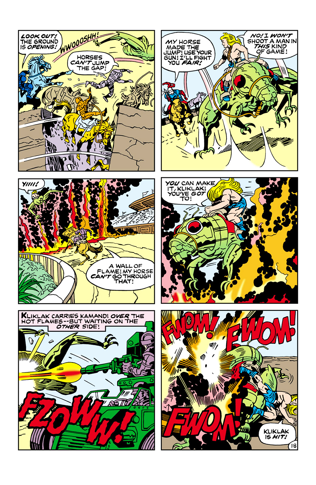
After his separation with Stan Lee in 1969, Jack Kirby created “Kamandi, The Last Boy on Earth” in which he uses a grid of five or six panels. (Courtesy of Jack Kirby)

By Joshua Greenberg
Feb. 11, 2015 12:23 a.m.
Comic books are everywhere – Marvel and DC Comics are mining decades of story lines for a huge slate of movies and television shows. But comics are more than a source to be mined for superhero blockbusters. New creators are dealing with issues every month in ways that couldn’t be done in other formats – issues of comic books.
The question of the millennial era is: When sending someone a text using only emojis, how many are used to communicate the idea? Comics are the same way.
Comic books can never show things moving because they’re static art. They have to use visual cues – typically the position of panels to lead the eye along the page smoothly. Complicated or unclear art can take the reader out of the story by breaking the flow. But when done properly, comics can compress and extend time to fit the moment.
Scott McCloud’s new 450-page graphic novel, “The Sculptor,” puts his knowledge of the medium into practice. It’s about a down-on-his-luck artist who trades all but 200 days of his life for the ability to shape anything with his hands. But it’s really less about the plot and more about how art and people intersect, how we’re all trying to connect to each other. It’s a beautiful theme.
I don’t think “The Sculptor” hits all the emotional notes it wants to hit. But on a technical level, it’s so interesting to look at that it almost doesn’t matter. “The Sculptor” took me around two hours to read – it’s paced so that each page reads quickly, and the reader absorbs it as a stream of continuous images.
It takes cues from Katsuhiro Otomo’s sci-fi masterpiece “Akira,” which covers twice the material of the 1988 film version. “Akira” is about Tetsuo, an unhinged teenager given psychic powers by government experiments, and Kaneda, the leader of his biker gang, who tries to stop him from destroying the cyberpunk city of Neo-Tokyo and re-awakening the psychic who blew up the first Toyko.

Both “Akira” and “The Sculptor” use more panels and more space on the page in setting up their shots. They take the time to show different perspectives and use beat panels, like long pauses in a film; page spaces are used to show characters’ reactions and establish tone. Both have the luxury of as much space as they want – “Akira” through years of weekly publishing and “The Sculptor” by virtue of being a long, self-contained volume.
But more compressed comics can be just as effective at pacing. Jack Kirby was the renowned co-creator – with Stan Lee – and artist of the “Fantastic Four,” “X-Men,” “Avengers” and “Thor,” a phenomenal output over the space of a few years. Every issue he does is a self-contained story.
Kirby’s comics have so much energy they seem to jump off the page. He mostly uses a normal – compared to the oddly-shaped pages in “The Sculptor” and “Akira” – grid of five or six panels, but he makes full use of it by leading the eye to the next caption with exciting action.
There’s always movement and fresh ideas coming out of every issue and on every page. I don’t think it’s possible to be bored reading Kirby. Incredulous, maybe, but never bored. He reinvented the superhero genre in his romance and monster-influenced image, going on to do the now-classic “Fourth World” titles like “Mister Miracle” and “Kamandi, the Last Boy on Earth” at DC after his 1969 break from Lee.
Sometimes, when a comic originally published in monthly issues is collected, there’s a tension that’s lost.
Junji Ito’s “Uzumaki” makes this transition like nothing else. “Uzumaki” is about a small town invaded by a mysterious spiral nemesis that insinuates itself into people and changes them in supernatural ways. “Uzumaki” does these weird single-issue stories that don’t ever fully satisfy with a conclusive answer. Then he strings the plots that have been underlying together into a nightmarish overarching story that leaves the reader as unsettled as a “Twilight Zone” episode. It’s one of the freakiest comics I’ve ever read, and the pacing – going from normal, to strange, to normal again in a loop each chapter, as it was originally published as a weekly manga – is important to the way I read it.
When done poorly, flow can drag down a whole work. Aaron Diaz’s “Dresden Codak” is a beautifully painted webcomic and good transhumanist science fiction. But it’s hard to read – overly fancy panel structure with lots of tiny boxes makes it confusing at times. It’s hard to tell where the reader’s eye should move next. It can be too clever for its own good. Many webcomics post a single page at once, and some try to leave a punchline or lead every update, but that choice doesn’t really matter as much when reading the archive later.
Ultimately, pacing in comics is all about doing something that draws out the desired emotional response, like in any medium. There’s no universal speed.
What’s the most strangely formatted comic you’ve ever seen? Email Greenberg at [email protected].


